Short answer: a brand guidelines template has seven sections: brand basics, logo, color, typography, imagery, voice and tone, and a page of do's and don'ts. Each section states a rule, gives the exact values (hex codes, font names, sizes), and shows one right and one wrong example.
Below is that template, section by section, with fill-in tables you can copy into a doc, a deck or a Figma file. Then: style guide vs brand kit vs brand book, and how to stop the guidelines being ignored once they're a PDF.
The brand guidelines template at a glance
| Section | What it answers | Must include |
|---|---|---|
| 1. Brand basics | Who we are and who it's for | One-line positioning, audience, values |
| 2. Logo | Which logo, where, how big | Versions, clear space, minimum size, placement, misuse |
| 3. Color | Which colors, in what share | HEX, RGB, CMYK, roles, contrast pairs |
| 4. Typography | Which fonts, at which sizes | Families, a type scale, case and spacing rules |
| 5. Imagery | What our photos and graphics look like | Subjects, style, crops, treatments, consent |
| 6. Voice and tone | How we sound | Traits, words to use and avoid, sample rewrites |
| 7. Do's and don'ts | The common mistakes | One page, with examples |
Keep it short. With a page or two per section, the template comes to about ten to fifteen pages. Every page should help someone make a decision.
1. Brand basics
One page, read in a minute. Copy this:
What we do: Brand helps audience do something without pain.
Who it's for: Primary audience, secondary audience.
What we stand for: Value 1, value 2, value 3, each with one sentence on what it means in practice.
Contacts: Questions about the brand go to name, email. The latest files live at link.
The last line matters: a downloaded copy goes out of date, so say where the current version lives.
2. Logo usage
This is the section people check most, so make it exact.
| Rule | Fill in | Example |
|---|---|---|
| Versions | Each lockup and when to use it | Full logo (default), icon (avatars, favicons), wordmark (narrow spaces) |
| Clear space | Empty space on every side, as a multiple of a logo measure | 0.5 × the logo's height on all sides |
| Minimum size | Smallest it may appear, on screen and in print | 24 px tall on screen, 10 mm in print |
| Placement | Preferred corner or position | Top left on social posts, centered on covers |
| Backgrounds | Which version on light, dark and photo backgrounds | Dark logo on light, white logo on dark, white on photos with a scrim |
| File formats | What to use where | SVG for web, PDF or EPS for print, PNG with transparency as fallback |
Define clear space with a measure taken from the logo itself, so it scales with the logo. A fixed pixel number only works at one size.
Logo misuse. Show each of these crossed out, using your real logo: stretched or squashed, recolored outside the palette, rotated, with a drop shadow or outline added, placed on a busy photo without a backing, rebuilt in a different font, and cropped.
3. Color palette with HEX, RGB and CMYK
List every color with its role and all three codes. HEX and RGB are for screens. CMYK is for print.
| Role | Name | HEX | RGB | CMYK | Use for |
|---|---|---|---|---|---|
| Primary | Harbor Blue | #1F3A5F | 31, 58, 95 | 67, 39, 0, 63 | Headlines, logo, buttons |
| Accent | Signal Amber | #F2A541 | 242, 165, 65 | 0, 32, 73, 5 | Highlights, one call to action per design |
| Background | Paper | #F7F4EE | 247, 244, 238 | 0, 1, 4, 3 | Page and card backgrounds |
| Text | Ink | #1C1C1E | 28, 28, 30 | 7, 7, 0, 88 | Body text |
| Success | Field Green | #2E7D5B | 46, 125, 91 | 63, 0, 27, 51 | Positive states, checkmarks |
The CMYK numbers above are straight conversions from RGB, which is fine for a first draft. Real print values depend on the paper and the press, so get them confirmed by your printer from a proof. If you print with spot colors, add a Pantone column.
Three more rules belong in this section:
- Proportions. Something like 60% background, 30% primary, 10% accent tells people the accent is for emphasis, not for full backgrounds.
- Contrast pairs. List which text colors are allowed on which backgrounds. Body text should reach a contrast ratio of at least 4.5:1 against its background, which is the WCAG AA level for normal text.
- Tints. If lighter or darker shades are allowed, list them by value. Don't leave it to "use a lighter blue".
4. Typography
Name the families, then give a type scale so nobody has to guess sizes.
| Style | Font | Weight | Size | Line height | Letter spacing | Case |
|---|---|---|---|---|---|---|
| Display | Heading font | 700 | 80 px | 1.05 | -2% | Sentence |
| H1 | Heading font | 700 | 62 px | 1.1 | -2% | Sentence |
| H2 | Heading font | 600 | 40 px | 1.2 | -1% | Sentence |
| Body | Body font | 400 | 32 px | 1.4 | 0 | Sentence |
| Caption | Body font | 400 | 26 px | 1.4 | 0 | Sentence |
| Label | Body font | 600 | 20 px | 1.2 | +4% | Upper |
The sizes above are for a 1080-pixel social graphic; give print sizes in points separately. Also name a fallback for when the brand font isn't installed, such as in email: "Use Arial if Heading font is missing."
5. Imagery
Words alone don't describe a photo style, so pair each rule with two or three example images.
| Category | Rule | Example |
|---|---|---|
| People | Real customers and staff, natural light, looking at the task, not the camera | Team at work, customer using the product |
| Product | Clean background, one product per shot, soft shadow | Packshot on Paper |
| Places | Wide, uncluttered, daylight | Office, store, venue |
| Treatment | One look for all photos | Slightly warm, a little less saturation, no heavy filters |
| Crops | Keep faces and products clear of text | Leave a third of the frame for copy |
Add a consent line: only show people who agreed to appear in your marketing.
6. Voice and tone
Voice stays the same everywhere. Tone shifts with the situation. A simple table does most of the work:
| We are | We are not | Sounds like |
|---|---|---|
| Clear | Vague | "Your order ships Tuesday." |
| Warm | Gushing | "Thanks for waiting. Here's what changed." |
| Confident | Arrogant | "This works. Here's how." |
Then add:
- Words we use and avoid. "Customers", not "users". "Sign up", not "register". Spell product names the same way every time.
- Mechanics. Headline case, spelling (US or UK), dates and numbers, emoji.
- Two rewrites. One message written off-brand, then on-brand. It teaches faster than any list of adjectives.
7. Do's and don'ts
One page that a busy person can scan. Put a real example next to each line.
| Do | Don't |
|---|---|
| Use the logo files from the shared folder | Screenshot the logo from the website |
| Keep clear space around the logo | Put the logo against the edge or another logo |
| Use palette colors by name or hex code | Pick a color "close enough" by eye |
| Set headlines in the heading font, sentence case | Mix three fonts in one design |
| Keep text on photos readable with a scrim | Put thin text over a busy image |
Brand guidelines vs style guide vs brand kit vs brand book
People use these words loosely:
- Brand guidelines and brand style guide usually mean the same thing: the rules above.
- A brand kit is the files and values people actually use: logo files, color codes, font files, templates. It's what someone needs to make a design today.
- A brand book is the long version, often with the story, mission and strategy behind the identity, aimed at people inside the company.
You need the rules and the kit. The trouble is that they live in different places, and the rules are a PDF nobody opens while designing.
Keep the guidelines enforced in every design
Guidelines fail in the gap between the document and the design tool: a hex code copied by hand, the wrong logo file, a headline at a size the guide never mentions. The fix is to make the guidelines the source the designs read from, not a document they're checked against.
That's what Brands in bannx does. A brand is a set of tokens that templates bind to, and most sections of the template above map straight onto it:
| Guideline section | Where it lives in a bannx brand |
|---|---|
| Logo versions | logos.logo, logos.icon, logos.wordmark |
| Clear space, minimum size, placement | logos.rules: clear space as a multiple of the logo's height, a minimum height, and a preferred horizontal and vertical position |
| Color roles | colors.primary, colors.accent, a neutral ramp from surface to text, and success, error, warning and info |
| Type scale | typography.styles: display, h1, h2, body, caption and label, each with font, weight, size, line height, letter spacing and case |
| Imagery | images.* lists for lifestyle, product, people, screenshots, backgrounds, cutouts and places, and a filter per category |
| Spacing and corners | look.margin, look.spacing, look.radius |
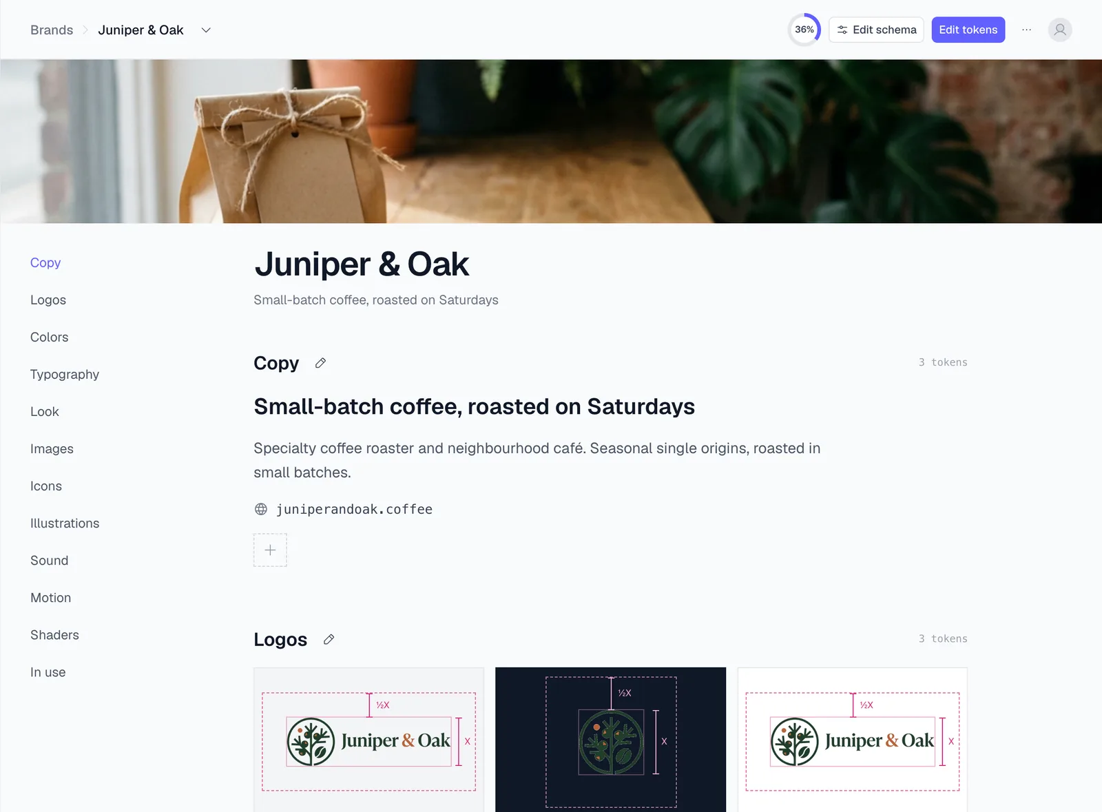
You don't have to type it all in. On the Brands page, New brand reads a kit from your website URL: colors, fonts and logos, plus corner radius, shadows, gradients and button border. Then you correct what the site got wrong. A brand read from a website also gets a ready-made light or dark variant.
- Templates bind to the brand, not to values. A layer's fill is
colors.primary, a headline uses the h1 style, and a logo layer readslogos.logoand can bind its position to the logo rules. Change the primary color once and every template that uses it follows on its next render. - Campaigns don't break the base brand. A variant (Christmas, Black Friday, a dark theme) overrides some tokens. Apply it and every design re-skins. Stop applying it and the brand is exactly as it was. A brand holds up to 15 variants.
- Renders pick the brand. The Render API and the MCP tools take a
brand,brandVariantorbrandTokensfield, so one template renders on-brand for a different client or campaign without being edited.
For agencies that is one template per format, rendered for each client's brand. For one brand, a new hire can't pick the wrong blue, because there is only "primary". See the brand library page and the Brands docs for the full token list.
Start from a template
Templates are free to edit and download as PNG or PDF, with no account and no watermark. In the gallery, the Uses brand kit filter shows templates that read brand tokens, so they pick up your colors, fonts and logo once your brand is set up. Good first ones: the business letterhead for documents, and the social media templates for posts. More are in business templates. If you also need the files, the business card size guide covers the print side of the kit.
FAQ
What should brand guidelines include? Brand basics, logo usage (versions, clear space, minimum size, misuse), a color palette with HEX, RGB and CMYK values, typography with a type scale, imagery rules, voice and tone, and a do's and don'ts page.
How do I create a brand guidelines template? Copy the seven sections above into a doc or deck, fill in your real values, and add one right and one wrong example per rule. Then put the values somewhere designs can read them directly, so the document and the designs can't drift apart.
What is the difference between a brand kit and brand guidelines? Brand guidelines are the rules: how to use the logo, colors and type. A brand kit is the assets that follow them: logo files, color codes, fonts and templates. Most teams need both.
How long should brand guidelines be? There is no standard length. With a page or two per section, the seven sections above come to about ten to fifteen pages. Put the rules people check most, logo and color, near the front.
Do I need CMYK values if I only post online? Not today, but add them before anything is printed. Screen colors (RGB, HEX) and print colors (CMYK) are made differently, so ask your printer to confirm the CMYK values from a proof.